The UNO stadium project has imposed a great challenge. First of all, reinterpreting the pride of being a fan. The fan of a club identified by the feat, by the sporting achievements, by its sport references, its ability to overcome adversity, its greatness. To deconstruct the pride of “being a fan of Estudiantes” to be able to project in images the club´s DNA, the places where their identity resides, the spirit that surrounds and inspires the sense of belonging.
Read more about the project
All this, in turn, loaded with the longing of re-inhabiting a space of their own, a stadium that is re-inaugurated after 14 years of waiting. A field that had its golden years, where so many feats were accomplished, feats that occupy a unique space in the memory of every fan and are kept very fondly in their hearts.
Having this in mind, we faced the mission to give the space character. We tried to cover each wall with all the elements that identify the Club’s genetics taking into account not only the themes and contents, but also the style of representation with which each of the illustrations and pieces of art were elaborated, portraying glorious episodes of the club’s history. We decided that every wall in the stadium would speak in a compelling way.
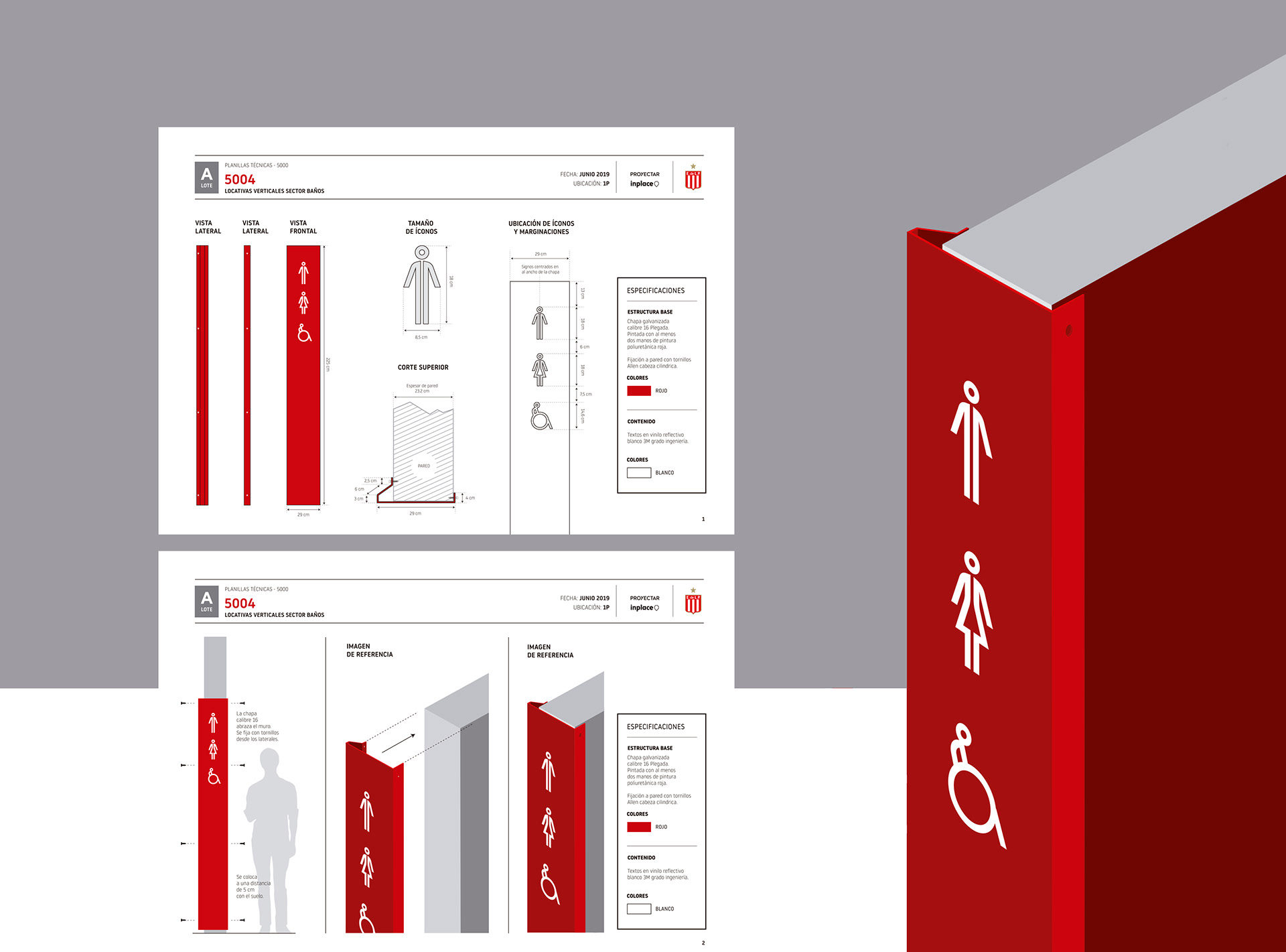
At the same time, together with the architects of this project, we dealt with the problem of spatial organization and circulation, to define in the best way possible the criteria that would help distribute, demarcate and emphasize entrances, to show the way and accompany people during their experience visiting the stadium, also operating on the signage and the nomenclature of the spaces.
A highlight in the project was the harmony achieved in the relationship between the architecture and the signage by using fixing and anchoring schemes which respected the architecture of the place and the uses that the space fosters, accompanying and enhancing it. At the same time, a careful selection of noble materials was made, materials of high resistance and durability together with simple and sustainable production systems. Local suppliers were there throughout all the stages of the process.
The identity of a club is very complex and difficult to analyse, but we know that people cling to their symbols, they take these intangible factors of a network of events and emotions that build the history of their relationship with the club and make them their own. And those, in turn, are continually rebuilt. That framework is alive. Understanding it, questioning it and projecting it was not an easy task.
Along the way, we understood that each person feels the same but in different ways. Memories, anecdotes shared with their parents, grandparents and friends. Due to the fact that childhoods, joys, sorrows and experiences are so personal, we had to find common places that represent all the fans.
Along the way, we understood that each person feels the same but in different ways. Memories, anecdotes shared with their parents, grandparents and friends.
Illustrations and digital art: Inplace
Branding & Symbology Restyling: Inplace & Proyectar
Wayfinding & Signage: Inplace & Proyectar
Photography: Inplace
Production and installation: CiberRótulos


next project
Santander


